We started by asking Japanese travelers who had visited Taiwan what they actually came to night markets for. Twenty-two respondents, two short surveys: one on familiarity, one on stall preference. Two numbers came back clean.
User Research · Product Management · 2024
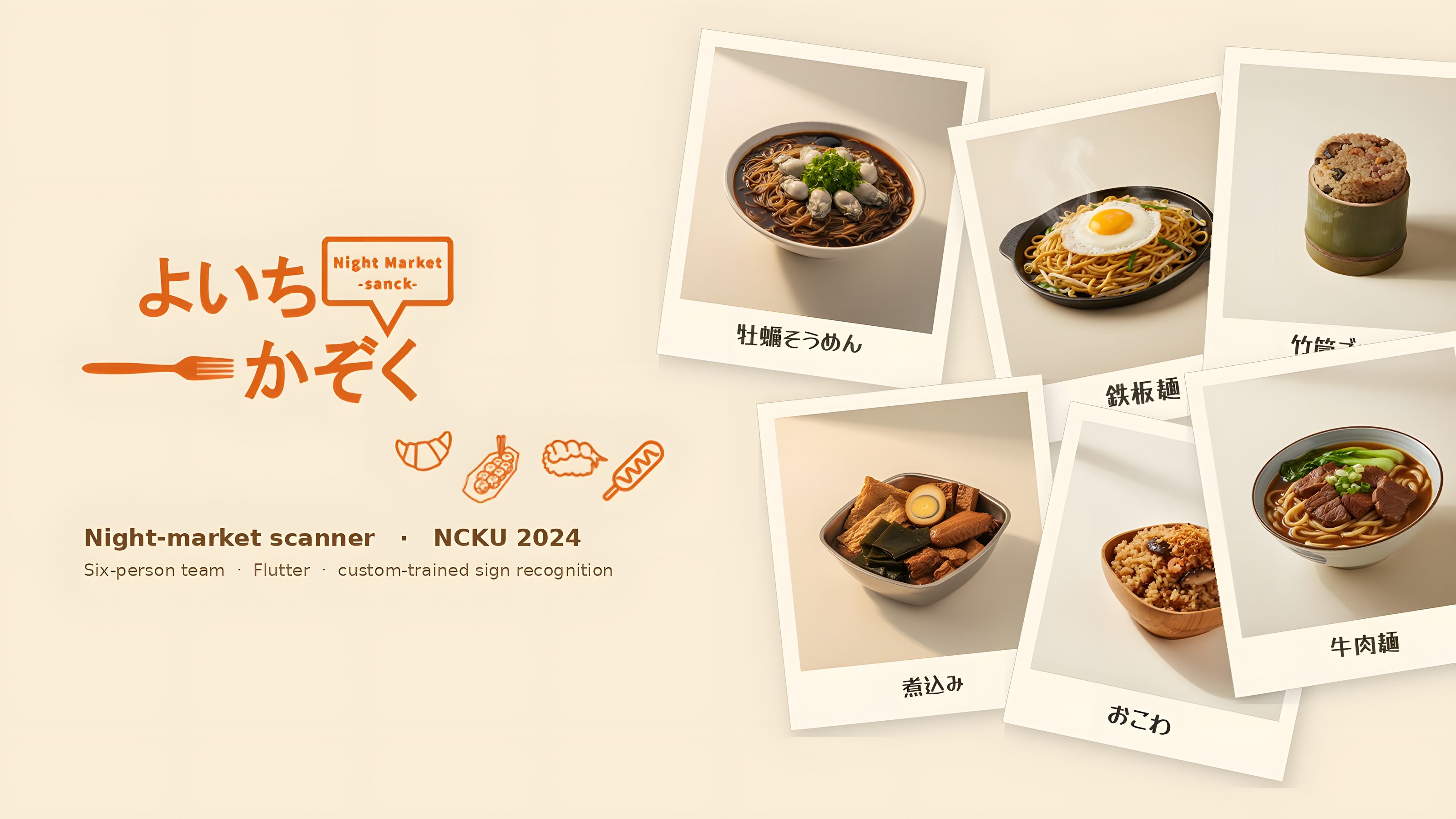
よいちかぞく 夜市家族
A scanner app for Japanese tourists in Taiwan’s night markets, built to read the signs that translation apps can’t. Four months, six people across design and engineering schools at NCKU.
01 · Research
Two surveys, one clear pull
20 of 22
Japanese travelers had visited a Taiwan night market at least once
100%
picked food when asked which stall type drew them in
The pull factors drawn from the open-ended
answers: the sights, the tastes, the things to take home, the
feel of being inside the crowd, the people. Food sat at the
center of every group. Even respondents who started with
souvenirs or games kept coming back to flavors and smells.
02 · Persona
Yamada Kenichi, 27, Osaka
From the survey groups we drew one persona. Not because one person stands for twenty-two, but because the team needed a shared face to design against. Yamada is who we sketched on the wall.
- Name
- 山田健一 Yamada Kenichi
- Age
- 27
- Job
- Office worker, mid-tier salary
- Lives in
- Osaka, single, with parents and a younger sister
- Travel style
- Solo, deep dive, follows social-media food trails
- Goal in Taiwan
- Eat the local way — recognize it, pronounce it, order it
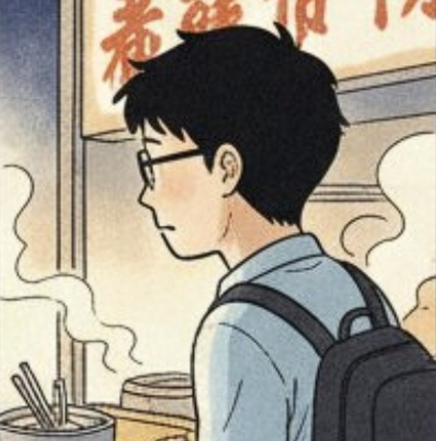
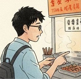
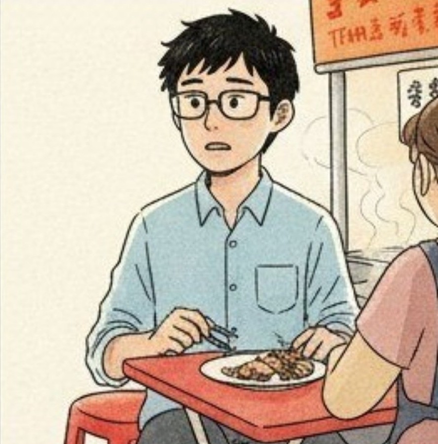
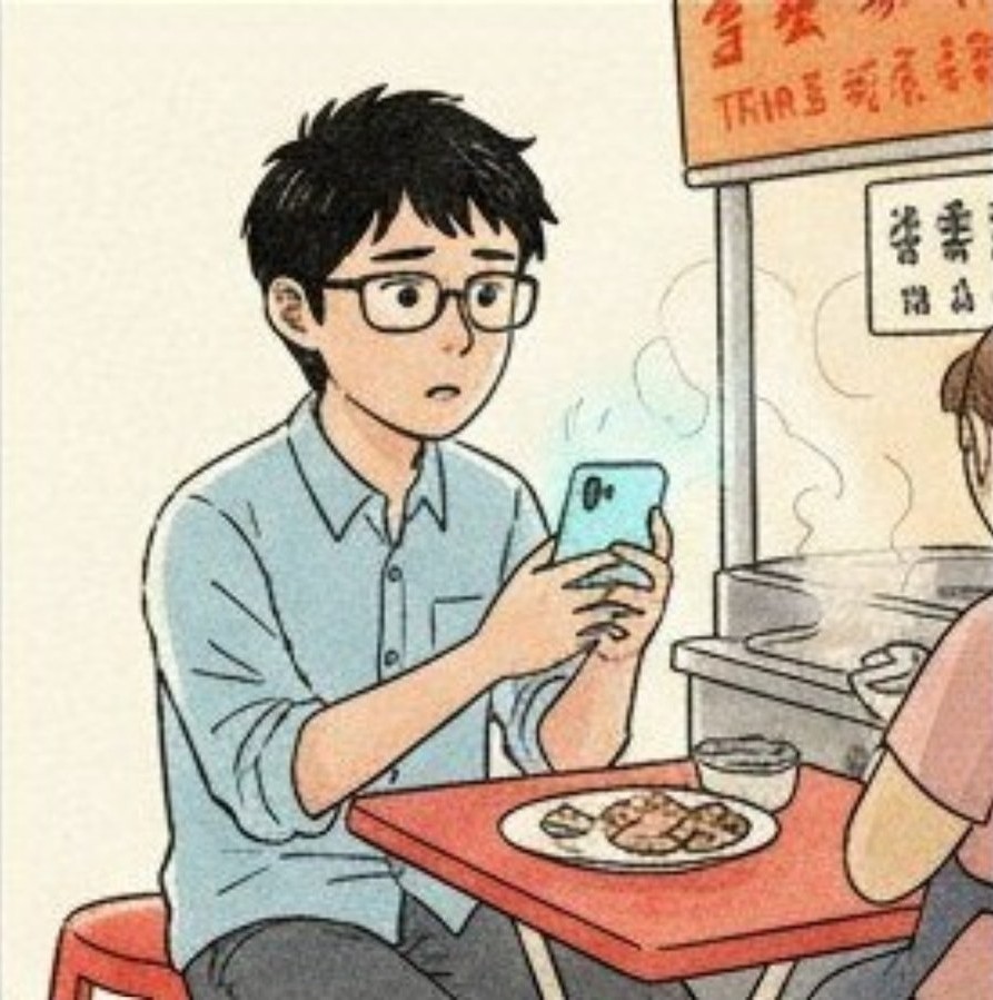
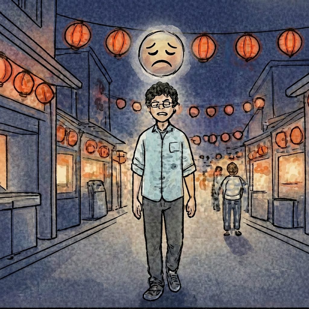
“I can roughly tell what the food is. I just don’t know its name, what’s inside it, or how to ask for it.”
- Name recognition Chinese characters look familiar but mean different things in Japanese — close enough to mislead, not close enough to help.
- Visual unfamiliarity Some dishes look nothing like what he expects, and some of those dishes might contain things he can’t eat.
- Ingredients & method Not sure what’s in the sauce, whether it’s fried or stewed, how spicy “a little” will be.
- Ordering language Pointing works; specifying anything beyond “this one” doesn’t.
Below, the four challenges acted out as a single evening. Six beats, one traveler. The journey map in comic form.
03 · Solution
Snap it, name it, learn it, or search it.
Brand state. The frame before any functional UI loads.
Home tab. Tonight’s nearby night markets at a glance.
Second tab: 美食名冊, the dish directory. Salty, sweet, drinks, favorites. Browse before you go.
Fourth tab: profile. Language, theme, dietary-flag toggles.
Camera tab. The reason we built the app.
Edge detection + OCR against a closed set of food-sign images.
The stylised lettering gives only one clean character: 球. The app surfaces every dish containing 球. No false certainty.
Selected entry: image, Japanese reading, ingredients, dietary chips.
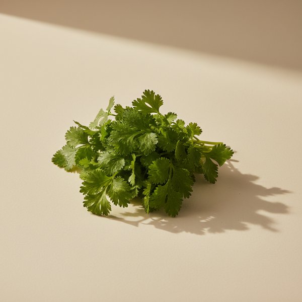
User profile flagged sesame. The app cross-references it against the ingredient list.
Allergen alert. The same flag travels with the order to the vendor.
04 · The translation wall
When OCR works and still fails
For most signs, generic OCR holds up fine. Point the camera, extract the characters, hand them to a translator. The characters arrive. The food doesn’t.
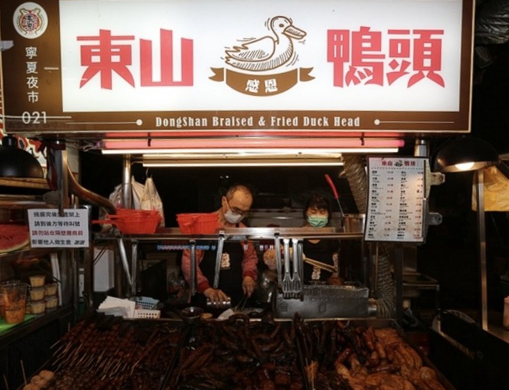
OCR reads these four characters cleanly. Google Translate gives back “Donshan Duck Head.” A Japanese tourist still has no idea what this stall is: a self-serve braised-stew counter from Tainan’s Donshan district, where you point at items in a warming tray and they’re tossed in spiced soy broth to order.
That gap is what the case is about. Yamada doesn’t need a better OCR pipeline. He needs the cultural context the name is shorthand for: what form of dish it is, how it’s served, what commonly goes in it, whether anything in it might break his dietary rules.
So we built that context. We walked through three night markets, collected forty-eight photos across thirty-two food categories, and annotated each one by hand: name, region of origin, cooking method, common ingredients, dietary flags. The model doesn’t just recognize the characters. It pulls the cultural entry behind them.
05 · Strategy
Translation apps and travel apps each miss half
Before we built, we scanned the field. Two categories existed already: generic translation apps and Taiwan night-market travel apps. Each had what the other lacked.
| Feature | App A | App B | App C |
|---|---|---|---|
| 中/日 translation | yes | yes | yes |
| OCR text recognition | yes | yes | yes |
| Domain-tuned for street food | — | — | — |
| Voice synthesis | yes | yes | yes |
| Food intro / image / ingredients | — | — | — |
| Feature | App D | App E |
|---|---|---|
| Nearby-market discovery | yes | yes |
| Map & landmark queries | yes | — |
| Stall recommendations | — | yes |
| Translation | — | — |
| Food intro / dietary alerts | — | — |


05b · Positioning
Where the value lives
We mapped each feature on two axes: how directly it solves Yamada’s pain point (horizontal), and how much emotional surprise it brings (vertical). Two patterns came out clean.
The lower-right quadrant (Essential Foundations) is crowded. Every translation app and every night-market travel app already covers it. We had to build the baseline, but it wouldn’t set us apart.
The upper-right quadrant was empty. That’s the wedge: features that meet the same pain point but bring emotional surprise. Domain-specific image recognition tuned for night- market signage. Cultural context attached to every dish, not just a literal translation. That’s where 夜市家族 placed itself. The dashed arrow below traces the iteration path: build the baseline, then push the wedge.
06 · Database
One studio aesthetic, thirty-eight dishes
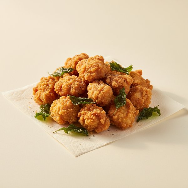
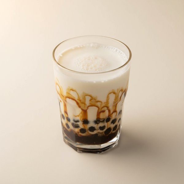
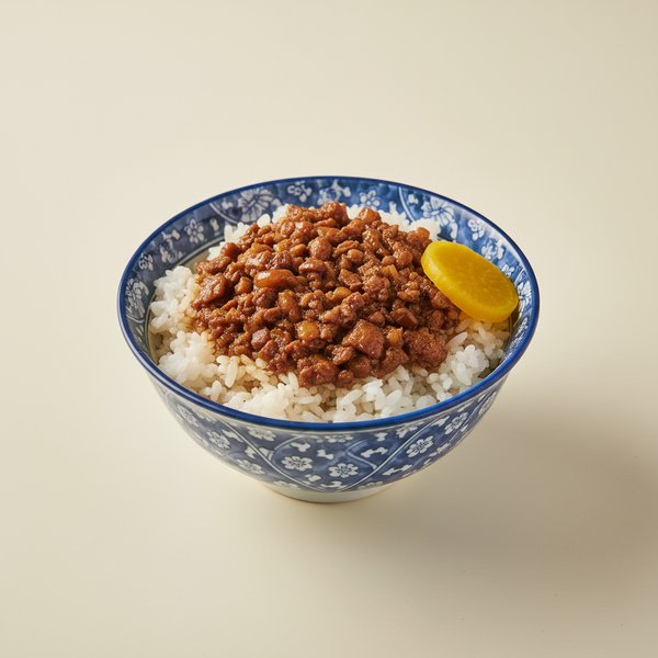
We wanted the food-intro screen to feel like a single confident voice, not a scrapbook of borrowed images. A shared visual language across every dish mattered more to us than photo realism. So we built the image library ourselves.
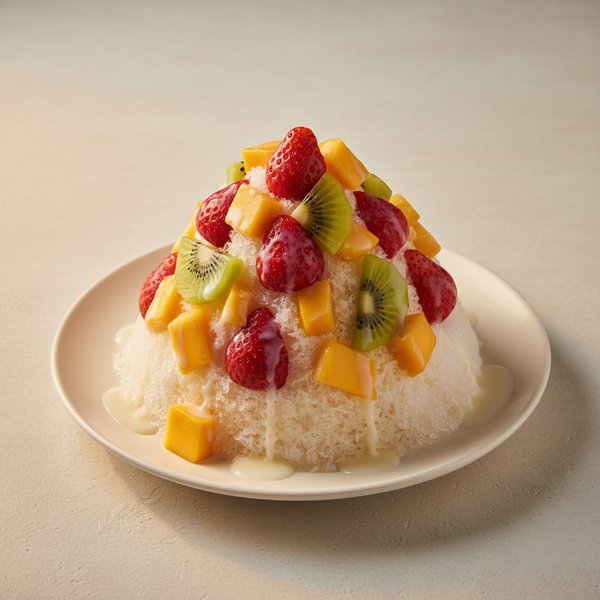
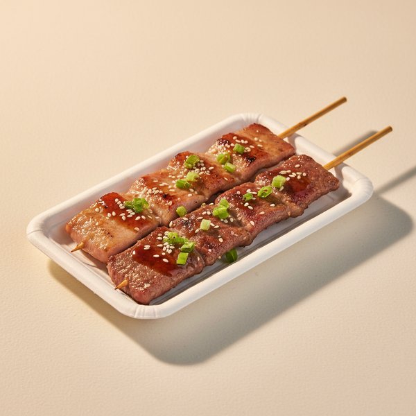
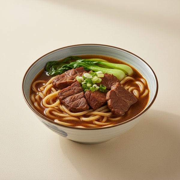
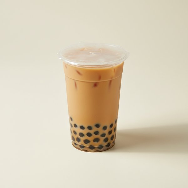
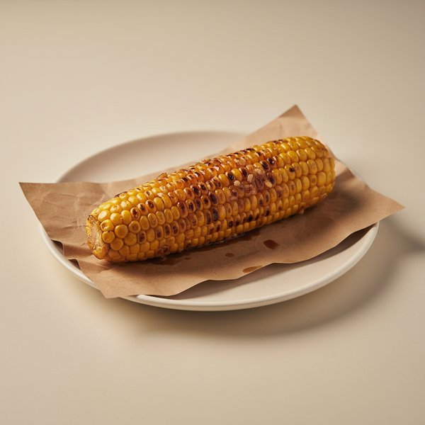
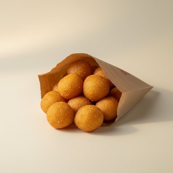
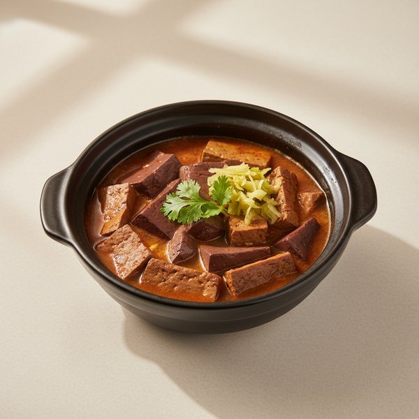
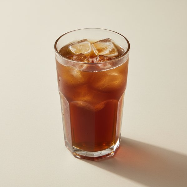
Thirty-eight studio-style AI photos across savoury, sweet, drinks, and a fourth category for the ingredients we flag as common dietary triggers. One lighting style, one camera angle, one plating style. The image Yamada sees in the app holds together dish to dish, even when the stall version varies.
Database schema.
Each food entry carries six fields:
name · intro · keywords ·
dietary_flags · image ·
popularity. Three top-level categories (savoury,
sweet, drinks) plus a separate ingredients table for the
dietary-flag lookups (peanut, shellfish, cilantro, chilli,
alcohol).
07 · Visual system
Wordmark and palette
One wordmark, one palette. Both running through every screen of the app.
08 · Reflection
What we learned, three ways
Three lessons came back from the four-month cycle. One about method, one about scale, one about how a designer and engineer team actually ships something together.
Method
Closed-domain beats generic when the domain is tight
The training set was forty-eight photos. In a generic setting that’s nothing. Inside a closed domain (Taiwan night-market food signs), it was enough to beat off-the-shelf OCR. The trade-off is direct: we gave up coverage for accuracy on the exact thing the user needed.
Scale
Manual annotation doesn’t scale. Government registry might.
The pipeline we used can’t cover a city, let alone an island. At commercial scale, the clean path is an upload platform run by night-market associations. Vendors share their own sign-design files, and the model trains on those original files rather than photos of them. Until that platform exists, asking vendors to upload their sign photos in the app is the bridge.
Collaboration
The handoff line is the project
The bottleneck on multi-discipline student projects is rarely talent. It is whether the design clock and the engineering clock are set to the same time. Ours were, because week 7 was a hard handoff line both sides agreed on before the semester started.
Team
Six people, two disciplines, four months
A class collaboration between NCKU’s Industrial Design and Computer Science master’s programs. Three members on each side of the handoff.
Design school · weeks 1–7 main effort, weeks 7+ asset support
Survey, persona, paper prototypes, wireframes. After handoff, design supported the engineering team and hosted midterm and final presentations.
- 許庭瑜 Hsu Ting-Yu Team Spokesperson & Linguistic QA Hosted the midterm and final presentations. N2 Japanese — translated and wrote the introduction copy for every dish.
- 顧文宇 Ku Wen-Yu Survey Runner & Field Photographer Ran the Japanese-traveler survey and field-photographed the sign training set.
- 陳禹任 Chen Yu-Jen UX / UI Designer Took the team’s wireframes through lo-fi to final Figma interface design.
Engineering school · weeks 7+ build
From wireframe to working Flutter app: integration, model training, mobile features.
- 李宗翰 Lee Tsung-Han Software Engineer · Integration Owned engineering integration and second-half scheduling.
- 洪靖睿 Hong Jing-Rui Computer Vision Engineer Trained the closed-domain sign-recognition model on the field photos.
- 鄭勝謙 Cheng Sheng-Chien Mobile Front-End Engineer Flutter front-end plus device-API integration: camera capture, haptic feedback, native hooks.